


 What I like - the tall backs, the warm wood tones and cushions - over all the chairs are very comfortable for sitting. We don't like that we can only fit three stools. I have two children and when they each have a friend over, only three can sit. Also we don't' like how the stools protrude into the walking area.
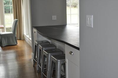 What I like: Aesthetically I like their lines and the way their color ties in with the stainless steel in the kitchen. I love how four stools (and children) fit. I also like how they push in and make a clear pathway for walking by. I don't like how cold they are to sit on in the morning and how uncomfortable they are with out a back. I also worry they are just too industrial looking (a family lives here after all!)
 Cambridge is a famous historical area of Boston. Today it is the home of Harvard and MIT, with trendy shops in Harvard Square. A beautiful area along the famous Charles River. But in 1826 Cambridge was famous for glassmaking. It was one of only three areas in the US that was producing glass, competing with England, which was the prominent glass producer of the time. Glass Workers in those days were apprenticed and generally in need of housing. When my friend Leonard, mentioned the history of his house I was immediately excited to visit. Leonard's house is one of six attached Row houses, or Workman's Cottages. They are on Cambridge's Historic Preservation Registry but are not as heavily bound by the restrictions as other designated historic areas. As such, Leonard has been able to move walls and renovate in way that truly brings out the flavor of this interesting old building. In anyone else's hands this building could have been ruined, but with Leonard's thoughtful eye and talent the results are fabulous. Let's have a look!


 His new master bathroom is to die for!
  Here is a shot of the back of the house. You can clearly see where the dormer was added to increase the size of the master bedroom and make the office nook.
 Finally a closer look at the brick courtyard off the kitchen. This amount of property in Cambridge is unusual and Leonard has done a wonderful job of making it a wonderful outdoor entertaining space.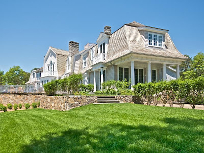
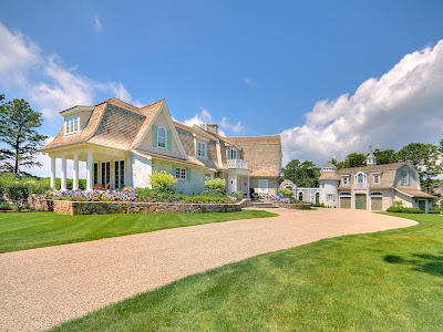 The house was designed by the renowned designer Fritz Kreiger. For three years craftsmen worked on his vision to create this spectacular residence. He incorporated many antique elements such as doors, columns, and windows into the design. The home is being sold fully furnished with the finest collection of antiques and appointments. All photos are from Sotheby's. The main house has 12 rooms, 4 bedrooms, 6 full baths and 2 half baths with over 7,928 sq. ft. It sits on over 7 and a half acres. It also has a guest house on the property.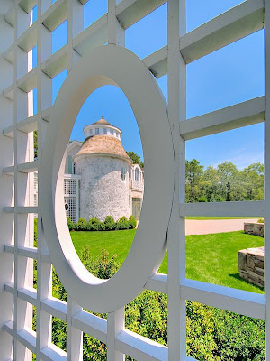
Notice the main house with it sweeping lawn, lovely porches and cedar shingle roof. The quintessential beach house!
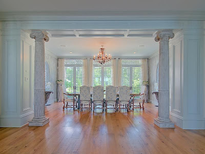
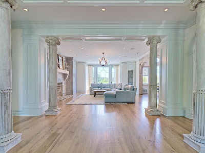 The living room and dining room have many antique architectural elements incorporated in their design. Notice the columns. The chandeliers were all imported from Paris.
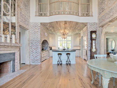 The kitchen features a professional eight burner Parisian stove and a two story breakfast area with a dramatic wall of whitewashed Boston brick. Notice the post and beams built in with the whitewashed brick. It is difficult to tell for sure, but it looks like a slate or soapstone counter. I love the antique mirror over the fireplace and vintage wooden doors. These rooms also include chandeliers from Paris. I love the whitewashed wooden ceiling and railings in the top photo.
 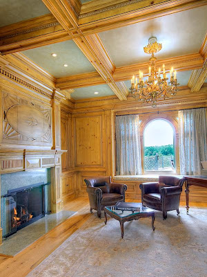 The spectacular Library features unparallelled craftsmanship. Notice the work over the fireplace and again the chandelier from Paris.
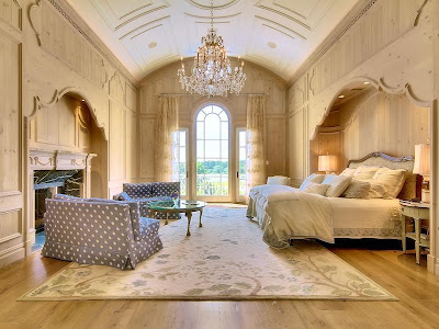 The Master bedroom has an incredible arched ceiling, wood paneling and built in bed. The effect is similar to the main sleeping cabin of a luxury yacht. The wood has been slightly distressed and whitwashed. Chandeliers again from Paris.
 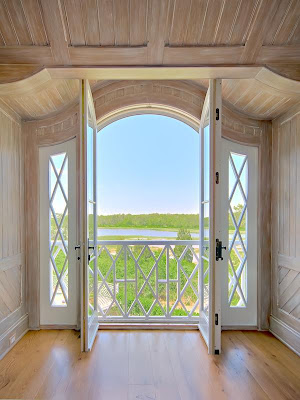 Here is a close up picture of the French doors.
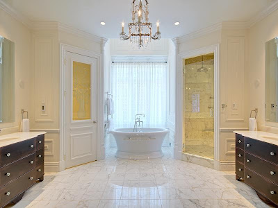 The master bath is magnificent with glass etched doors reminiscent of Lalique styling. Notice the white marble floors with the dark wood. Stunning!
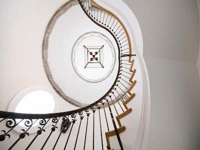 Architectural splendor! The circular staircase with hand forged iron railing brings you up the turret to the guest house.
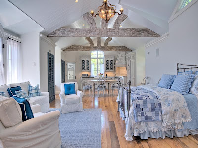 The Guest House is a charming retreat. Whitewashed beams, painted furniture , iron beds and a blue and white color scheme are lovely.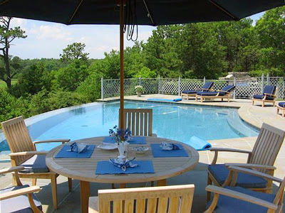
No beach house is complete with out a pool area. This seems to be an area with out the same level of thought and planing. I do not care for the fence.
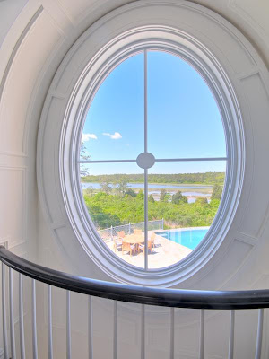
The final view through a small window in the upstairs of the house shows the water and the pool perched above. It is hard to believe this house is new construction. Makes me hopeful that wonderful building craftsmen still exist in America.
 Outside of the busy city of Antwerp, Belgian antiques dealer and designer, Henri Charles Hermans and his wife Natasha Hermans, also a designer, decided to relocate their business and their home to this wonderful 19th century Farm. Henri Charles Hermans, who once worked and studied under the famous Axel Vervoordt, found this property to be the perfect canvas to showcase the couples wonderful minimalist Belgian design style.
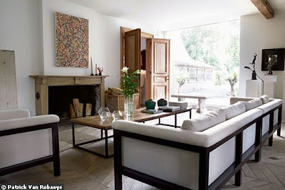


 The stark simplicity of the stairway is just beautiful. Notice the first step and is carved stone and the rusted iron railing. The furnishings echo the simplicity of the space.
 An attic bedroom is the epitome of minimalism, with a Belgian twist. The antique bench at the foot of bed is covered in antique linen.
 Here is a close up the of the Empire style zinc bathtub- notice the spectacular patina set off by the rustic milking stool.
 In another hallway is a wonderful compilation of antique wood: oak table holds a walnut bowl filled with burl wood balls.
 Hanging in the family room above the antique mantel is an artwork piece of ink writings from an ancient Hindu prayer book. The art work hides the television. Low trestle coffee table and linen slip covered sofas round out the Belgian style.
 Antique marble topped bistro table and linen covered sofa look lovely. Waxed concrete floors and french doors open to the the outdoor terrace.

 What a lovely garden terrace. Fabulous antique table and twig style chairs make for perfect outdoor dining.
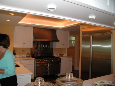
When I bought my house I felt the kitchen needed some minor renovation. Here's what I liked: the layout and the windows across the entire back of the space,which gave it incredible light. I liked the white cabinets, and the recessed ceiling in the kitchen area. What I didn't like was the lack of a center island and the way the cabinets seemed cut the space in half. I disliked the backsplash, and the very badly scratched white Corian counters. I also disliked the lack of mouldings and details, that were so abundant in the other rooms of the house. These pictures were taken when the house was for sale and include the previous owners furniture and accessories.


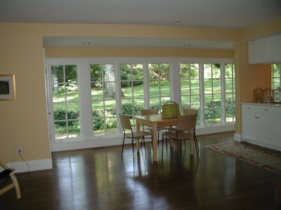
The area above is also the family room space, though they had taken out the couch and love seat. I felt like the table was too close to the family room. An area needed to be added for the table to have its own space. During this renovation we designed and created a glass breakfast room for the table.
Here are some inspiration photos:

This is a Victoria Hagen kitchen. I loved the soapstone, subway tile and pendant lights. I also liked the beadboard ceiling, but perhaps a bit more scaled back.

 These two kitchens are from the Swedish Company, Kvanum Kok. I love the hardwood floors, soapstone counters and glass cabinets. I especially fell in love with the X cabinets.
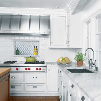
I loved this box out behind the stove for oils, peppermill, etc. I liked the different tiles with the white subway tile. But I preferred Calcutta marble in a herringbone pattern like this one below:
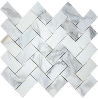
Here's my inspiration:
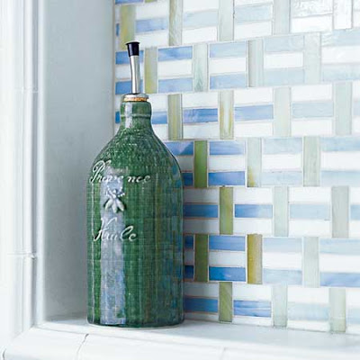 Here is my box out behind my stove:
 Here is the full view. I also added a marble shelf. It is a small feature but it adds so much!
  Here is the after:
 Notice the plain ceilings in the before picture and the beadboard ceilings in the after. Also new sinks and faucets and moulding details. I also added ice box latches and bin pulls to the cabinets.
 Here is a great picture of the windows which have been raised up about 4 inches so the door and window moldings align.
 And after:
 New gas fireplace and mantle. Notice the detail work; the moldings wrap the entire room and match the living room moldings which are original to the house.
 Here is another view which peeks into the living room and dining room. (The clock is an art piece by a local artist who uses salvage materials to create new objects)
  Finally the kitchen looking toward the Butler's pantry. I think the gray walls of the kitchen with a touch of marble and beadboard ceiling, ties in nicely with the gray cabinets, marble and beadboard in the pantry.


