You often see hanging shade pendant lights as in the photos above from House Beautiful and MLS. These lights are from Vaughan Lighting.
The top light is called the Menton Hanging Shade the bottom and the Nickel Hanging Shade from Vaughan lighting. Both are only available to the trade.
The Kensington Pendant is a wonderful copy available from Shades of Light. A bargain at only $279.
Circa Lighting
Here are some School House Pendants. These are very easy to find from both the higher end lighting manufacturers or the more affordable manufacturers.
The first is from Restoration Hardware, the second from Shades of Light , both very affordable and classic in styling.
Making a subtle change in your own kitchen by adding classically styled pendant lights is just one way you can get a step to closer to one of America's most copied kitchens.
Labels: Christopher Peacock, Kitchen, Lighting
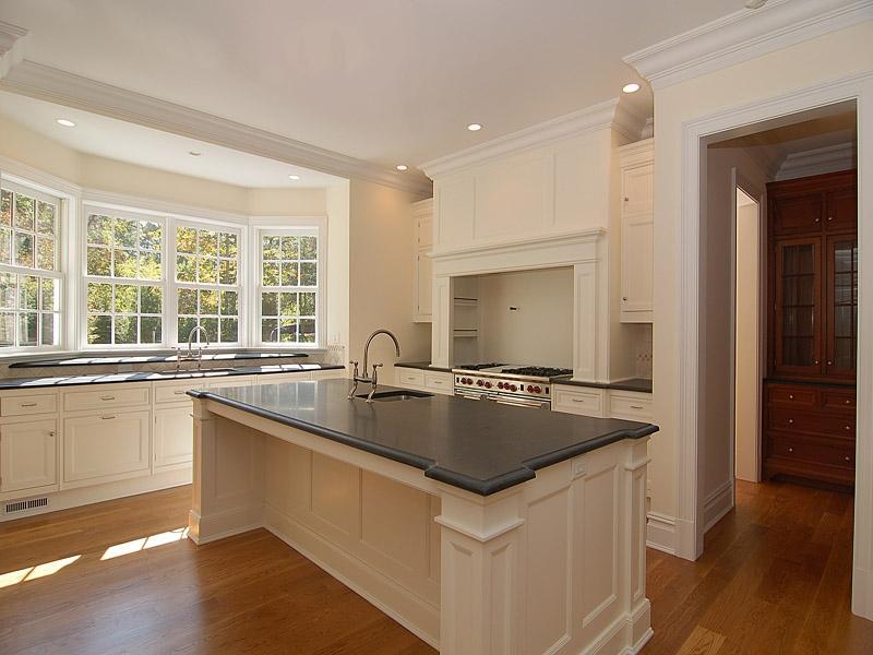
In my quest to revamp my kitchen and pantry, I have studied countless Christopher Peacock Kitchens for inspiration. Because Christopher Peacock limits images which can be copied I was able to locate some of his work via Real Estate listings in Hampton, NY and Greenwich, CT. All the pictures below are from real estate listings which noted that the kitchen was designed by Christopher Peacock.
The signature Peacock White Scullery Kitchen. Counters are carrera marble with a white subway backsplash. Notice the pot filler behind the stove and high arc faucets. The pendant lights are usually hung in twos or threes. These lights are from Circa.

Another signature Peacock white kitchen. Cabinetry is inset and counters are soapstone. This kitchen also has High arc faucets and pot filler. Note that the stove hood design is similar. Also notice the notched corners on the island, both are signature Peacock styles. One interesting feature of this particular kitchen is the sink in the center island. I read an article where Peacock mentioned he does not generally prefer to have a sink in this location. He said he liked the center island sleek and unobstructed.
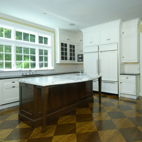
Another carrera marble kitchen. I love the darker wood floors with these cabinets, versus the lighter floors above. Notice the faucets are also high arc and brushed stainless. These particular faucets are KWC Systema style, very pricey. Also notice the ice box style hinges and latches on the doors. This kitchen has inset stainless steel drawers. I am not a fan of these, as a mother of two, I just could not keep them fingerprint free.
Here is a lovely Peacock kitchen in the Hampton's. These floors are not wood, but a lovely slate - very pretty. I love the butcher block and marble island. Notice the glass front subzero refrigerator. I love the color of this kitchen and the multiple surfaces; marble, soapstone, slate and wood.

These two pictures are from a Peacock kitchen that is in a new spec home in Greenwich. The floors are amazing! Notice the marble and soapstone counters; and classic bin pulls and latches on the cabinets. I like how you can see the microwave in the bottom right photo, but when you enter the kitchen it is hidden on the side by the refrigerator. Inset cabinetry, pot filler, subway tile - seeing some trends?
Here is a different style Peacock kitchen. This is from an older home. I think probably a kitchen done by Peacock before his White Scullery Kitchen got so popular. Notice the heavier mouldings on the door and corbels. Notice the apron front sink, classic white school house pendant lights and large wood cabinet knobs. I am not a huge fan of the green hood though.
Here is another one from the Hampton's. I love the warmth of this kitchen. Although a white kitchen, it does not have the starkness of some the others. The backsplash behind the stove is lovely. It is small marble bricks with an inset arch; nice touch. The ceiling and the fixtures lend a more rustic feel.
This kitchen is obviously more formal. I love the X cabinetry. Pendant lights, ice box latches, bin pulls, marble and soapstone complete the look. Another notched corner island with a rectangular sink.
Here is the final kitchen from the real estate listings, notice the backsplash behind the stove. Here they use a solid piece of marble - you really get to see the veining in the stone. Also note the center island with sink and wood top. Perhaps clients do not always agree that a center island should be unobstructed.
My next post will highlight where to find some of these elements if you are interested in creating this look yourself in your home.
Labels: Christopher Peacock, Kitchen, Washington Post
Who doesn't love the look of a traditional Butler's Pantry? The Butler's Pantry is making a comeback in American and English homes as part of a resurgence of nesting and homekeeping since the late 1990s. It is one of the most requested features in American homes today, despite larger kitchen sizes than ever before. There is a charm and nostalgia to the pantry, as well as a practical, utilitarian purpose.


Labels: Beadboard, Butlers Pantry, Marble, Soapstone, Subway Tile
Recently Traditional Home interviewed James Radin, an interior designer and set designer for the popular movie "Something's Gotta Give". They discussed his idea of "traditional minimalism." Here is what he had to say:
The key is to start with the interior architecture — cabinetry, moldings, the physically immovable part of the whole thing. A lot of great old houses were very rich in wall and ceiling paneling, interesting floors. Even the pantries would have great detailing like beautiful tiles. Get the interior architecture right, and then fill in with comfortable furnishings.
That restricted sort of palette is conscious. The initial impression is that it's plain, but it's a house that slowly reveals itself to you — so it stays interesting when you live there. There are a lot of subtle variations in textures and colors — mostly blues, whites, beiges — and lots of different patterns in the fabrics, the rugs, the spongeware. That's what saves it from blandness and makes it come to life. Often when people decorate with the blue-and-white look it fails, because it's just blue and white. It's like dressing all in black. It works if there's black patent with black silk with black wool...the subtle variations that I mentioned

The main thing was that they wanted comfortable, easy, usable rooms. Nothing formal. In the living room, we have elegant wood paneling, but an eclectic mix of furnishings — all slightly mismatched — to take away any stuffiness.
 You'll see that the master bedroom has a touch of formality to it. We were after a crisper, dressier effect there. It's a little fancier than anything downstairs because it's more private, so things could be more fragile.
Thanks James Radin -what a lovely home!
Labels: James Radin, Traditional Minimalism
This is a lovely dining room. Notice the detailing on the chairs with coordinating upholstered checked backs. The lamps on the side board and beautiful chandelier complete the look!
Labels: Iris Hill, Linda Banks


