
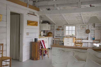
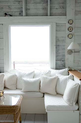
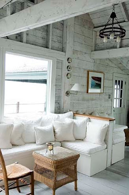
 The cottage is sparsely decorated; intentional so you take in the spectacular ocean views. Here is the couch area from a different angle. I love the whitewashed walls which remind me of sun -bleached driftwood.
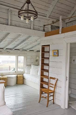 Opposite the seating area is a ladder to the loft above and a daybed tucked below. As you can imagine the views from every direction are breathtaking.
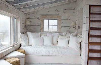
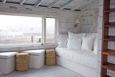 With this view I am quite sure I would never leave - it gives a whole new meaning to word "bed-rest"!
Labels: Coastal, Jamie Salomon, Ocean

Labels: Butlers Pantry, My House
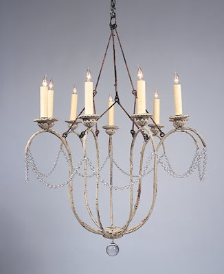
 This photo from Things that Inspire via Anne Hepner gives you a very good shot of the piece. This example shows the fixture with shades, which I opted not to do. Here you see how nicely it looks in an informal room.
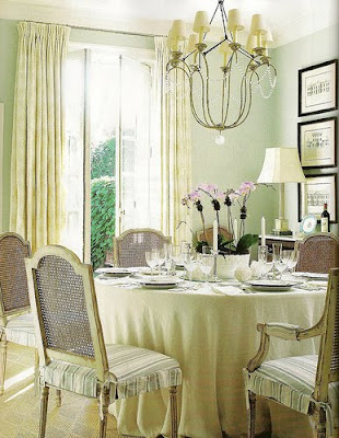
 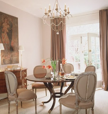 This photo from Things that Inspire via Caldwell Beebe gives you a clear picture of the crystals that surround the fixture. I like the sparkle the singular strand brings to the room. It add a interest but its not too fussy. This room is also lovely, though a bit more formal than my breakfast room, but notice the similarities in the chair style and curtain selection.
 I am sure you recognize this room from Better Homes and Gardens, which has been all over the blogs. Here you can see an example of the 12 arm style.
 Niermann Weeks writes about the Italian Chandelier on their website.
They first found antique sconces, which led to the design of the chandeliers. They mentioned that English designer Nina Campbell hangs the Italian chandelier in her own bedroom, and every time she’s moved, it’s moved with her. The photo above is not Nina Campbell's bedroom, but another gorgeous room from the talented Catalano Architects.
Holly at Things that Inspire did a wonderful, comprehensive post on the Joe Niermann and the Niermann Weeks company. To read more about it click Here
Labels: Catalano Architects, My House, Niermann Weeks
 I love to find designers who have a look and style that is fresh and fun, but also traditional. Designers who have a coastal look that is so wonderful and leaves you wanting more.
  So I was thrilled to be reacquainted with the work of Molly Frey from Marblehead, Massachusetts via House of Turquoise. (if you have a moment do go over and see all Erin's wonderful posts - I never miss one!!)
  I say reacquainted because I had also seen Molly Frey's work via Bandelle and had put that wonderful post in my saved file in the summer.
 When I went to Molly Frey's website I was reminded once again how much I admire her work. I have saved clippings from many of her rooms which have appeared in Traditional Home, Better Homes and Gardens, Renovation Style and New England Home.
She has a wonderful coastal style. Fresh and clean. She also writes a blog! Do take the time to see of more of her beautiful rooms. She has an incredible talent -and it's wonderful escape from these cold New England winters.
And don't forget to spend some with Erin at House of Turquoise!
Labels: Beadboard, Kitchen, Marble, Slipcovers, Subway Tile, Upholstery
This before picture was taken during our home inspection. At this point the previous owners had removed much of their family room furniture - all that remained was their small kitchen table and some odd chairs. You can see that the wall of windows was about 3 feet beyond the solid wall. A larger table would have ended up looming into the Family room space. So, when we were ready to renovate we pushed back the wall and added an additional nine feet to create a dedicated breakfast room. Here is the breakfast room after!
We added a gas fireplace, mantel and surrounded the area with crown moulding. We also placed a much larger TV above. Winter is long here so the fireplace makes the space so much more cozy.
From this...
Three weeks ago I got a call from New York. It was the editor from AOL's DIY Life. She was calling to offer me the opportunity to come on board as a regular contributor and writer for their site.
(Insert squeals of excitement and laughter, here!)
After explaining to me all of the details, responsibilities and expectations...I couldn't refuse the offer! She had found me through my blog and loved what she saw!
(You can bet there was a whole lot of blushing involved...thank goodness she couldn't see me!)
So what can you expect to see from us on DIY Life?
To start, you'll be seeing previous projects that we have worked on and posted on ITLT, but the difference is that each post will be a "How To". A step-by-step process of how it was accomplished, with easy to follow directions.
First up, by request from my editor, the simple key holder that I made for our entryway by our garage...
 It is an easy project that is totally customizable to your home's decor and a simple way to achieve the exact look you want for very little cash!
(You can see my original post about it, here)

You can check it out over on DIY Life:
Homemade: Scrabble Key Holder
Our next article...
A "How To" for our Living Room Fireplace Makeover.
 We have received many emails about the details of this project, so an in depth post is definitely in order. I'll let you know when it's published!
We will also be working on brand new projects that will be featured on DIY Life. We have some big ones planned for 2010 and we can't wait to get started on them!
In March, DIY Life will be relaunching with a whole new look and feel and I am so excited to be a part of it. If you have never visited DIY Life (part of the AOL Network) head over and browse around. It's packed with useful tips, good information, craft projects, reviews and How To's. Chances are, if you're visiting ITLT, then DIY Life is right up your alley!
Enjoy!
Labels: DIY Life
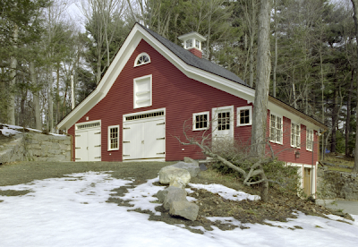 What do you do with an old, dilapidated barn? The rear of this barn had actually collapsed and had to be rebuilt. Here is the before picture.
 The wonderful people at Landmark Services, who are well versed in restoring and renovating, really brought this barn back to life.
  The barn had significant work done including new insulation, plumbing, siding and trim. The doors were replaced to add to the "carriage house" style. The original stone walls were kept. As if the this outdoor renovation wasn't thoughtful enough the owners added a wonderful gem...
 A fabulous spa like lap pool. Notice the skylights and spectacular wall of decorative stone work!
 I also love the french doors. The gliding barn door adds such charm.
Wouldn't you love to escape here?
Labels: Barn, Landmark Services
 This kitchen from Southern Living turned up both in my inbox and on the Gardenweb! Everyone agreed the windows were wonderful. This kitchen won high marks because of its size, it is so large the storage aspect would not be compromised.
 Another kitchen from Southern Living with a similar feel, though this kitchen had a mix of windowed walls and storage walls. Having both seems to be a popular trade off.
 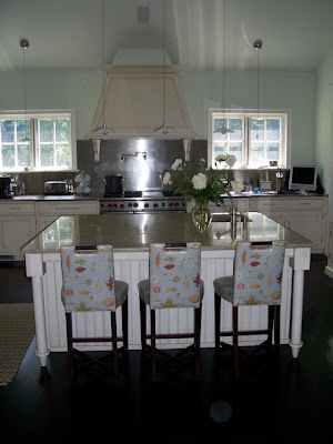 Linda Banks of Banks Design (one of my favorite designers) contacted me. She mentioned she wrote an article over 15 years ago in the now defunct, Decorating and Remodeling Magazine, shunning upper cabinets. She continues to limit their use in her kitchen designs. Here is a beautiful kitchen she did in CT.

 Many of these kitchens highlighted different types of storage - Here we see a copper pot rack on the wall. This could easily free up a lower cabinet for dishes. This kitchen is from Plain English.
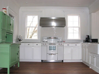 Many readers also mentioned that omitting the upper cabinets is easier when other types of storage are available. This kitchen from HGTV shows a Hoosier cupboard.
 Photos of European kitchens came my way - here is another one from Plain English. This is a favorite of mine, I love simplicity and warmth in this kitchen.
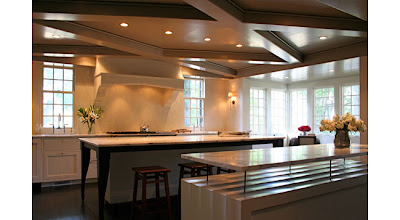 Another blogger directed me to architect Ruard Veltman who often sans upper cabinets. Isn't this kitchen fabulous?!
  Here is another angle of this great room! Notice the wonderful inset shelves on the left.
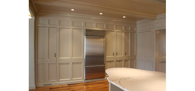 Most readers agreed that having a Butler's Pantry or large wall of cabinetry allowed the rest of the kitchen to be freed up to allow for windows. Veltman outdid himself with this striking wall of cabinetry.
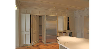 This wonderful paneled wall turns into a trove of hidden cabinets. Spectacular! To see more of Veltman's work here. To see more on Butler's Pantries click here.
Labels: Butlers Pantry, Kitchen, Linda Banks


